How to use CSS flex at a glance
 2592
2592Typically, page layout uses property display - it helps to make the element display the way you want. It has a lot of possible values, and not so long ago new values were added that allow you to typeset pages in a completely different way. One such value is flex .
The job of this property is that the container will behave in a flexible way - it will stretch or contract in order to place the elements in the correct way. There is no longer any need to use the float property, since display : flex allows you to make the correct alignment not only horizontally, but also vertically, as well as perform other operations with elements. For this, new CSS properties have been added, they allow you to control the entire flex design - some properties apply to the main container, and others to the elements of this container.
What properties are there for the container ? List below:
- display - sets the display style of the block, possible values: flex, inline-flex ;
- flex-direction - designed to change the direction of the main axis of the container, possible values: row, column, row-reverse, column-reverse ;
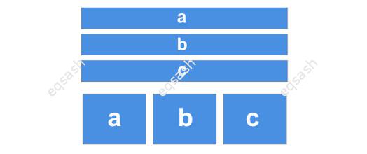
- flex-wrap - controls the wrapping of non-fitting elements, possible values: nowrap, wrap, wrap-reverse ;
- flex-flow is a property that combines the flex-direction and flex-wrap properties, essentially a short summary of two properties. As values, you can specify both the values of the first property and the second, or immediately the values of two properties separated by a space: row nowrap, column wrap, column-reverse wrap-reverse ;
- justify-content - aligns items along the main axis, possible values: flex-start, flex-end, center, space-between, space-around, space-evenly ;
- align-content - aligns items along the cross axis, possible values: stretch, flex-start, flex-end, center, space-between, space-around, space-evenly < / em>;
- align-items - allows to align items along the cross axis within the row, possible values: stretch, flex-start, flex-end, center, baseline .
What properties are there for container elements ? The calculation of the arrangement of elements inside the container in some cases also depends on the specified value for the container in which they are located. List below:
- flex-grow - allows you to set the growth factor of an element when there is free space in the container, possible values are set as numbers;
- flex-shrink - allows you to set the shrink ratio of an item, the opposite of the above property, possible values are set as numbers;
- flex-basis - allows you to set the base width of the element, possible values: %, px, em , etc .;
- flex is a shorthand for flex-grow, flex-shrink, flex-basis . Possible values are appropriate, you can specify 1, 2 or 3 values at once;
- align-self - changes the align-items property only for a single element, possible values are the same;
- order - changes the order of an element in the general row, possible values are set as numbers.
The article briefly reviewed how to use the flexibility of building blocks on a site page using the CSS flex technology, and also provided a list of properties with descriptions . This technology should be used with caution, only modern browsers support it.
Latest articles
- 03.04.24IT / Уроки PHP Уроки простыми словами. Урок 3. Все операторы PHP с примерами, с выводом работы кода на экран.
- 02.04.24IT / Уроки PHP Уроки простыми словами. Урок 2. Типы данных в PHP с примерами.
- 02.04.24IT / Уроки PHP Уроки простыми словами. Урок 1. Коротко о языке веб-программирования PHP. Основы синтаксиса.
- 09.11.23IT / Database Errors when migrating from MySQL 5.6 to 5.7 and how to fix them - database dump import failed with an error or INSERT does not work. Disabling STRICT_TRANS_TABLES strict mode or using IGNORE
- 09.07.22IT / Misc Convert office files DOC, DOCX, DOCM, RTF to DOCX, DOCM, DOC, RTF, PDF, HTML, XML, TXT formats without loss and markup changes
Popular sections
Eqsash (Tools)

Amessage (Communication)