Linear and radial gradients in CSS, how to create a gradient on a website
 3784
3784When developing a project design, there are times when it is necessary to create a gradient on the site , that is, a smooth transition of color from one to another. Previously, it was problematic to do this using standard means, but with appearance of CSS3 made it possible to make gradients quickly and easily.

To obtain a gradient effect, you can often see the use of special pictures, on which a gradient is created in a graphics editor. But this is not the most practical way, plus the unnecessary loading of the image on the site, which in itself reduces the site load speed. And if there are many such pictures, then everything is even worse. So something had to be done about it.
Gradient can often come in handy on any site, so in CSS3 it was decided to add functionality to create such gradients. Distinguish between linear and radial gradients . In the picture above, on the left is a linear gradient, on the right is a radial gradient. If suddenly the browser does not support a gradient, then in the style file above the line for specifying the gradient, you should specify a simple background for the element.
There is a linear-gradient value to create a linear gradient, and a radial-gradient value for a radial gradient. In addition, there are two functions for repeating the gradient, repeating-linear-gradient and repeating-radial-gradient . There is no separate property for adding a gradient, it is considered a background image, therefore it is added via the properties:
- background,
- background-image,
- border-image,
- list-style-image.
Let's look at some examples of creating gradients. The gradient is created using the corresponding function and its parameters. The first parameter of the function is position, you can use keywords. The second and third parameters are the color value and its position in the gradient.
  & lt; style>
div {
width: 300px;
height: 150px;
float: left;
}

.linear-gradient {
background: linear-gradient (to top, #ccc 5%, #fff 100%);
}

.radial-gradient {
background: radial-gradient (ellipse closest-side at center, #ccc, #fff);
}
& lt; / style>
& lt; div class = "linear-gradient"> & lt; / div>
& lt; div class = "radial-gradient"> & lt; / div>
To indicate the position, first write to , and then add the keywords top, bottom, left, right and their combinations, the word order is not important. Also, instead of the keyword, you can specify the slope of the gradient line, which shows the direction of the gradient. First, a positive or negative angle value is written, after which deg is added to it, for example 30deg.
To create a complex gradient, you need more than 2 colors - CSS3 allows you to add an unlimited number of colors separated by commas. You can apply transparent and semi-transparent colors. For precise positioning of a color in a gradient, the color value is followed by its position in percent, pixels, or other units.
As far as radial gradients are concerned, they are similar to linear gradients. What is the difference between linear and radial gradients ? The fact that in radials one color passes into another like circles in water around a point, and not along a straight line. There are two forms of radial gradient: circle (circle) and ellipse (ellipse). They differ in appearance, the default is ellipse. Also, with the shape of the gradient, you can set its size, depending on the keywords used - the size is indicated through a space after the shape of the gradient.
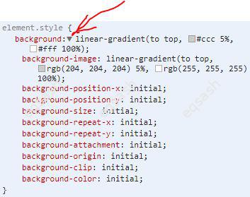
You can see in detail the possible values of the parameters of these functions in the developer console by specifying the desired function - after expanding the list of values by clicking on the arrow.
So anyone can create a gradient with CSS . Using gradients, you can make unique elements on the site, for example, using gradients and the background-size property, you can get various background images without using images. But it may not be very convenient to develop gradients yourself, so there are ready-made services on the net for generating gradient code.
Latest articles
- 03.04.24IT / Уроки PHP Уроки простыми словами. Урок 3. Все операторы PHP с примерами, с выводом работы кода на экран.
- 02.04.24IT / Уроки PHP Уроки простыми словами. Урок 2. Типы данных в PHP с примерами.
- 02.04.24IT / Уроки PHP Уроки простыми словами. Урок 1. Коротко о языке веб-программирования PHP. Основы синтаксиса.
- 09.11.23IT / Database Errors when migrating from MySQL 5.6 to 5.7 and how to fix them - database dump import failed with an error or INSERT does not work. Disabling STRICT_TRANS_TABLES strict mode or using IGNORE
- 09.07.22IT / Misc Convert office files DOC, DOCX, DOCM, RTF to DOCX, DOCM, DOC, RTF, PDF, HTML, XML, TXT formats without loss and markup changes
Popular sections
Eqsash (Tools)

Amessage (Communication)