How to use CSS grid features, properties summary
 4268
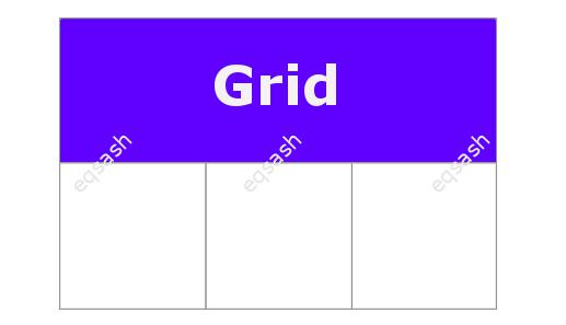
4268Over the entire existence of websites for their development, various approaches have been used for the necessary placement of elements on the page. Among such approaches were: table layout, using around elements with float , flexible layout with flex . But all these approaches are still not very convenient for development, since you have to make an effort to place the elements in the right way. Finally, a completely new page layout system comes to CSS - CSS grid .
The topic of CSS grid is quite large, the purpose of this article is just a quick look at the available properties for use in development. The CSS grid properties fall into two categories: properties for containers and properties for the elements themselves that are placed inside the container. This technology actively uses a new unit of measurement - fr (fraction), which usually represents a fraction of the free space in the grid.
What CSS grid properties are there for containers ? Consider the list below:
- display - sets the display style of the block, possible values: grid, inline-grid, subgrid ;
- grid-template-columns - defines a grid column, the values represent the size of the track;
- grid-template-rows - defines the row of the grid;
- grid-template-areas - serves to define a grid template, refers to the names of areas set using the grid-area property. Possible values: none,., Grid-area-name ;
- grid-template - shorthand for the properties grid-template-rows, grid-template-columns and grid-template-areas ; < / li>
- grid-column-gap - defines the size of the line width, you can set the width of the indents between columns;
- grid-row-gap - determines the size of the width of the lines, you can set the width of the indents between the lines;
- grid-gap - shorthand for grid-column-gap and grid-row-gap ;
- justify-items - aligns the contents of the container along the line axis, possible values: start, end, center, stretch ;
- align-items - aligns the contents of the container along the column axis, possible values: start, end, center, stretch ;
- justify-content - the property aligns the grid along the line axis, possible values: start, end, center, stretch, space-around, space-between, space-evenly ;
- align-content - the property aligns the grid along the column axis, possible values: start, end, center, stretch, space-around, space-between, space-evenly ;
- grid-auto-columns - Defines the size of any auto-generated tracks created by explicit column positioning;
- grid-auto-rows - Defines the size of any auto-generated tracks created by explicit row positioning;
- grid-auto-flow - this property controls the operation of the auto-placement algorithm, possible values: row, column, dense ;
- grid is a shorthand property for setting the above properties.
As you can see, the technology under consideration has all the necessary properties for flexible positioning of container elements. And what CSS grid properties are there for elements placed in a container ? Consider them also, the list below:
- grid-column-start - Determines the location in the grid by referencing the lines from which the element starts. Relevant for columns;
- grid-column-end - Determines the location in the grid by referencing the lines at which the element ends. Relevant for columns;
- grid-row-start - Determines the location in the grid by referencing the lines from which the element starts. Relevant for strings;
- grid-row-end - Determines the location in the grid by referencing the lines at which the element ends. Relevant for strings;
- grid-column is a shorthand property for grid-column-start and grid-column-end ;
- grid-row is a shorthand property for grid-row-start and grid-row-end ;
- grid-area - gives an element a name so that it can be referenced using a template created via the grid-template-areas property;
- justify-self - serves to align the content of an element along the line axis. Possible values: start, end, center, stretch ;
- align-self - serves to align the content of the element along the column axis. Possible values: start, end, center, stretch .
We have examined properties for flexible positioning of elements on the page using the new technology of web page layout. But apart from properties, there are also special CSS grid functions :
- repeat - can be used in the properties grid-template-columns and grid-template-rows , serves for dynamic repetition of templates;
- minmax - the function is used to determine a range of sizes, you can calculate a range that is greater than or equal to the minimum, and also less than or equal to the maximum;
- fit-content is a function that fixes the given size to the available size according to the specified formula.
Instead of a conclusion, it should be said that the CSS grid technology is quite new, its support began to appear only in new versions of modern browsers. So it might be worthwhile to wait a bit until this technology becomes ubiquitous.
Latest articles
- 01.03.26IT / Уроки PHP Уроки простыми словами. Урок 3. Все операторы PHP с примерами, с выводом работы кода на экран.
- 28.02.26IT / Уроки PHP Уроки простыми словами. Урок 2. Типы данных в PHP с примерами.
- 27.02.26IT / Уроки PHP Уроки простыми словами. Урок 1. Коротко о языке веб-программирования PHP. Основы синтаксиса.
- 26.02.26IT / Database Errors when migrating from MySQL 5.6 to 5.7 and how to fix them - database dump import failed with an error or INSERT does not work. Disabling STRICT_TRANS_TABLES strict mode or using IGNORE
- 31.01.26IT / Misc Convert office files DOC, DOCX, DOCM, RTF to DOCX, DOCM, DOC, RTF, PDF, HTML, XML, TXT formats without loss and markup changes
Popular sections
Eqsash (Tools)
Amessage (Communication)