How to make a responsive website and easy viewing on mobile devices
Every site nowadays simply has to be adapted for mobile devices, as from such devices share of traffic is significant . If the site is not suitable for phones and other gadgets, then visitors will simply close the site and go to the competitor's site. Also, search engines give preference to adapted resources.

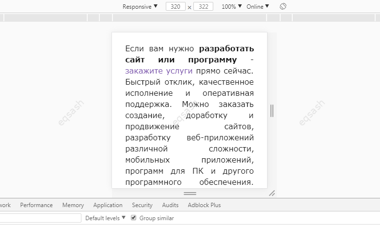
In order to make a responsive website, you need some knowledge of html and css . Responsiveness involves the automatic detection of device parameters, based on which the site is presented appropriately. Previously, special separate domains were made for this, on which mobile content was hosted, but this is not cost-effective at the present time. When developing the responsiveness of the site, for debugging you can use the mobile emulator built into the Google Developer Console , to open it you need to press F12 , then Ctrl + Shift + M .
A responsive site is based on a wireframe, blocks on a page that have relative widths, so it's important to abandon absolute values and use relative . But you shouldn't prescribe such values everywhere, you need to approach this process selectively, write them where they are really needed.
To make a convenient viewing of the site, you need to use media queries , with the help of them you can determine the minimum or maximum screen size and, accordingly, write css-rules for this size. Media queries are currently supported by most modern browsers, including mobile ones, making them a hassle-free experience. It is enough to define specific screen size points and create rules for them, these rules will be applied at these screen resolutions, and as soon as the rule does not match, other rules or default rules will be applied.
You can use ready-made libraries for layout, but you can build a skeleton for the site yourself and then use it wherever you need it. Independent developments are preferable, although someone calls them "bicycles" or "crutches", but this is the only way to understand how everything actually works, which will give more flexibility to the project. In addition, third-party libraries are always redundant code, some of which will not be used at all.
Thus, for a high-quality responsive site, it is necessary during development to use media queries , create css-rules for all required screen resolutions and correctly develop a framework from html blocks on the page.
Latest articles
- 01.03.26IT / Уроки PHP Уроки простыми словами. Урок 3. Все операторы PHP с примерами, с выводом работы кода на экран.
- 28.02.26IT / Уроки PHP Уроки простыми словами. Урок 2. Типы данных в PHP с примерами.
- 27.02.26IT / Уроки PHP Уроки простыми словами. Урок 1. Коротко о языке веб-программирования PHP. Основы синтаксиса.
- 26.02.26IT / Database Errors when migrating from MySQL 5.6 to 5.7 and how to fix them - database dump import failed with an error or INSERT does not work. Disabling STRICT_TRANS_TABLES strict mode or using IGNORE
- 31.01.26IT / Misc Convert office files DOC, DOCX, DOCM, RTF to DOCX, DOCM, DOC, RTF, PDF, HTML, XML, TXT formats without loss and markup changes
 2432
2432