HTML layout - how to check a site at different screen resolutions, where to get a mobile emulator
 7067
7067Currently, the site can be opened on a wide variety of devices with a wide variety of screen resolutions. To testing site pages at different resolutions , you should use a special toolkit provided by browser developers.
The easiest way to test a site at a different screen resolution is not to change the resolution itself on a PC, but to zoom in a browser. Downscaling corresponds to increasing the resolution, upscaling to decreasing the resolution. In this way, you can easily see how the various elements look and, if necessary, make changes.
A more advanced way is to use special toolkit . Previously, such tools were supplied separately - in the form of extensions for browsers (for example, Firebug), but now such functionality is usually built into browsers. This functionality also includes a mobile emulator for a website or a emulator of various screen resolutions .
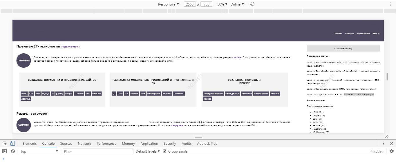
To use these features, just open the developer console in a browser. This can be done using a special browser menu item or using hotkeys that may differ for different browsers. After opening the console, you need to switch to a special mode - view mode on various devices , usually the button to enable this mode is located at the top of the console and is marked with the mobile devices icon. You can also use a keyboard shortcut.
The emulator contains various functionalities for testing, for example, the following basic features:
- select one of the popular screen resolutions or the whole device;
- setting screen resolutions manually;
- zoom;
- change screen orientation;
- switch power mode.
When the console is open, when the screen is zoomed, the upper right corner of the browser can display the corresponding screen resolution, which can be convenient.
Typically the emulator contains the following device types and permissions :
- Mobile S - 320px;
- Mobile M - 375px;
- Mobile L - 425px;
- Tablet - 768px;
- Laptop - 1024px;
- Laptop L - 1440px;
- 4K - 2560px.
This article has shown that for developing an adaptive version of the site , it is enough to use modern browsers with their developer consoles, which contain the necessary tools for checking the site at different screen resolutions .
Latest articles
- 01.03.26IT / Уроки PHP Уроки простыми словами. Урок 3. Все операторы PHP с примерами, с выводом работы кода на экран.
- 28.02.26IT / Уроки PHP Уроки простыми словами. Урок 2. Типы данных в PHP с примерами.
- 27.02.26IT / Уроки PHP Уроки простыми словами. Урок 1. Коротко о языке веб-программирования PHP. Основы синтаксиса.
- 26.02.26IT / Database Errors when migrating from MySQL 5.6 to 5.7 and how to fix them - database dump import failed with an error or INSERT does not work. Disabling STRICT_TRANS_TABLES strict mode or using IGNORE
- 31.01.26IT / Misc Convert office files DOC, DOCX, DOCM, RTF to DOCX, DOCM, DOC, RTF, PDF, HTML, XML, TXT formats without loss and markup changes
Popular sections
Eqsash (Tools)
Amessage (Communication)